
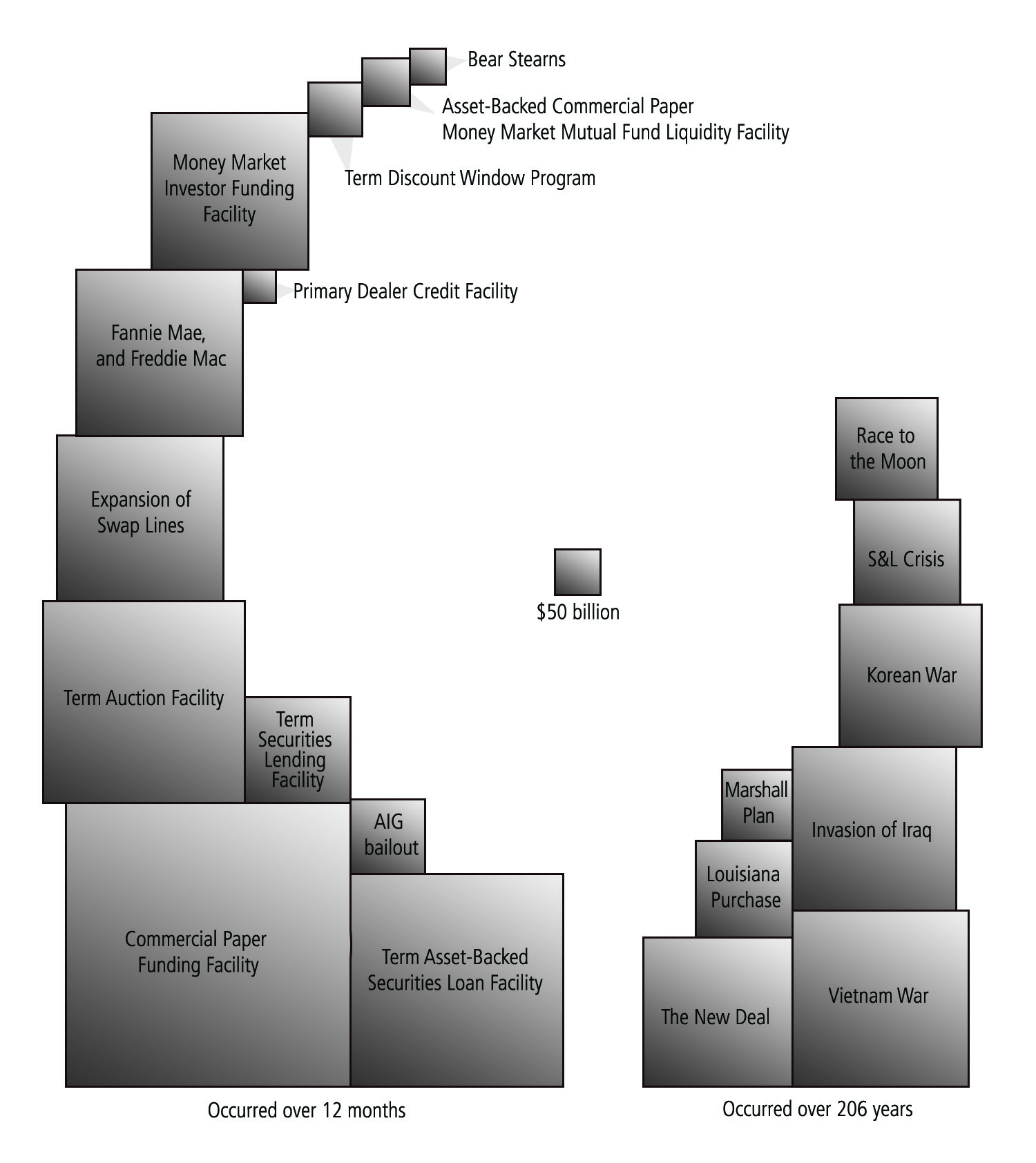
Here is an astounding graphic I came across this morning. It's an inflation-adjusted chart of the money spent on bail-outs in the past year vs. all previous one-shot expenditures (click on the image to see it large enough to actually read):
(http://www.ritholtz.com/blog/2009/06/bailout-costs-vs-big-historical-events/)
Nothing else even comes close to the amount of money we're dropping. This is not good. It rather seems to me that "too big to fail" may also mean "too big to save", at least without serious long-term ramifications to the value of our currency. Of course if the government wasn't spending all this stimulus/ bailout money it would be disappearing anyways due to liquidity issues and everyone cutting back at once, but so it goes.
Hey, at least we're mostly still young enough to tell our kids that it was all our parents fault.
No comments:
Post a Comment
Note: Only a member of this blog may post a comment.